AI Prompt
General
Fifa World Cup 2026 Sports Poster Showcase
Step into a world of intricate details with this fifa world cup 2026 sports poster showcase. Designed for absolute visual perfection and artistic expression.
View prompt →A masterful detailed japanese saas manager ad composition that elevates visual storytelling. This stunning gallery piece boasts exceptional detail and captivating energy.
Goal: Create a square Japanese promotional banner for {argument name="product name" default="BananaNL"}, a service that manages and reuses image across multiple tools. Canvas: 1:1 square social media ad, 768×768 style, soft lavender to white gradient background, bold modern SaaS advertising look, high contrast navy and purple typography, rounded UI cards, clean shadows. Layout: Top left has a cute white ghost mascot icon with two black eyes and a smiling mouth. To its right place the product name “BananaNL” in bold dark navy, with the smaller tagline “プロンプトとAI画像を、ひとつに。” underneath in purple. Top right has one rounded purple pill badge containing three lines of white text: “ChatGPT / Gemini”, “Grok / NotebookLM”, “対応!”. Center left contains the huge main headline in Japanese, split across two lines: “AI作業を、” in dark navy and “ひとつに。” in vivid purple. Add a curved purple arrow pointing from the headline down/right toward the supported service list. Main visual: In the lower middle, show a large floating browser/app window mockup with rounded corners and a pale UI. It should display a collection gallery with exactly 6 visible thumbnail cards arranged in 2 rows by 3 columns. The visible thumbnail styles are: 1) flat corporate illustration, 2) doodle notebook blue ink sketch, 3) clay stop motion cute scene, 4) black chalkboard layout, 5) colorful text heavy standard design, 6) monochrome manga page. The top bar should include small category labels/icons such as “Collection”, “今日”, “プレミアム”, “ビジネス”, and “人気300”, plus small window control icons. Under the thumbnails add small Japanese UI text suggesting popular , for example “人気プロンプト 30件 + プロンプト300”, and small footer links like “FAQ BananaX BananaX Biz”. Add a small yellow rounded badge on the lower left of the mockup reading “ Chat連携が人気→”. Right side integration list: Place exactly 4 stacked rounded white service cards connected by a faint dotted vertical line from the app mockup. The four cards, from top to bottom, are: 1) ChatGPT with green knot like icon, 2) Gemini with blue sparkle icon, 3) Grok with black slashed circular logo, 4) NotebookLM with black arc/rainbow icon. Use bold black service names. Feature strip: Along the bottom above the CTA, create exactly 4 equal feature blocks on a white translucent rounded rectangle. Each block has a purple rounded square icon and Japanese heading/body text. The 4 blocks are: 1) bookmark icon, heading “保存”, body “お気に入りのプロンプトを保存”; 2) magnifying glass icon, heading “検索”, body “必要なプロンプトをすぐに見つけられる”; 3) image icon, heading “画像管理”, body “AIで作った画像をまとめて管理”; 4) refresh/reuse arrows icon, heading “再利用”, body “複数のAIサービスでシームレスに活用”. Bottom CTA bar: Full width deep purple footer band. On the left include the same small ghost mascot and large white text “無料で始められます!”. On the right include a yellow rounded pill callout with dark navy text: “1日3回まで無料” and smaller line “シェアでさらに5回追加!”, plus small yellow accent rays. Visual style: Friendly Japanese startup SaaS ad, polished vector UI, soft shadows, rounded corners, minimal clutter, purple gradient accents, navy headline, crisp readable Japanese typography. Keep all Japanese text legible and preserve the service names exactly. Do not add extra service cards, extra feature blocks, watermarks, or unrelated logos.
Goal: Create a square Japanese promotional banner for {argument name="product name" default="BananaNL"}, a service that manages and reuses image across multiple tools. Canvas: 1:1 square social media ad, 768×768 style, soft lavender to white gradient background, bold modern SaaS advertising look, high contrast navy and purple typography, rounded UI cards, clean shadows. Layout: Top left has a cute white ghost mascot icon with two black eyes and a smiling mouth. To its right place the product name “BananaNL” in bold dark navy, with the smaller tagline “プロンプトとAI画像を、ひとつに。” underneath in purple. Top right has one rounded purple pill badge containing three lines of white text: “ChatGPT / Gemini”, “Grok / NotebookLM”, “対応!”. Center left contains the huge main headline in Japanese, split across two lines: “AI作業を、” in dark navy and “ひとつに。” in vivid purple. Add a curved purple arrow pointing from the headline down/right toward the supported service list. Main visual: In the lower middle, show a large floating browser/app window mockup with rounded corners and a pale UI. It should display a collection gallery with exactly 6 visible thumbnail cards arranged in 2 rows by 3 columns. The visible thumbnail styles are: 1) flat corporate illustration, 2) doodle notebook blue ink sketch, 3) clay stop motion cute scene, 4) black chalkboard layout, 5) colorful text heavy standard design, 6) monochrome manga page. The top bar should include small category labels/icons such as “Collection”, “今日”, “プレミアム”, “ビジネス”, and “人気300”, plus small window control icons. Under the thumbnails add small Japanese UI text suggesting popular , for example “人気プロンプト 30件 + プロンプト300”, and small footer links like “FAQ BananaX BananaX Biz”. Add a small yellow rounded badge on the lower left of the mockup reading “ Chat連携が人気→”. Right side integration list: Place exactly 4 stacked rounded white service cards connected by a faint dotted vertical line from the app mockup. The four cards, from top to bottom, are: 1) ChatGPT with green knot like icon, 2) Gemini with blue sparkle icon, 3) Grok with black slashed circular logo, 4) NotebookLM with black arc/rainbow icon. Use bold black service names. Feature strip: Along the bottom above the CTA, create exactly 4 equal feature blocks on a white translucent rounded rectangle. Each block has a purple rounded square icon and Japanese heading/body text. The 4 blocks are: 1) bookmark icon, heading “保存”, body “お気に入りのプロンプトを保存”; 2) magnifying glass icon, heading “検索”, body “必要なプロンプトをすぐに見つけられる”; 3) image icon, heading “画像管理”, body “AIで作った画像をまとめて管理”; 4) refresh/reuse arrows icon, heading “再利用”, body “複数のAIサービスでシームレスに活用”. Bottom CTA bar: Full width deep purple footer band. On the left include the same small ghost mascot and large white text “無料で始められます!”. On the right include a yellow rounded pill callout with dark navy text: “1日3回まで無料” and smaller line “シェアでさらに5回追加!”, plus small yellow accent rays. Visual style: Friendly Japanese startup SaaS ad, polished vector UI, soft shadows, rounded corners, minimal clutter, purple gradient accents, navy headline, crisp readable Japanese typography. Keep all Japanese text legible and preserve the service names exactly. Do not add extra service cards, extra feature blocks, watermarks, or unrelated logos.A masterful detailed japanese saas manager ad composition that elevates visual storytelling. This stunning gallery piece boasts exceptional detail and captivating energy.
Copy the full prompt
Use the copy button above to grab the complete prompt text.
Open Roopify AI
Click Generate image for free, optionally upload your photo, and generate with this prompt applied.
Customize and create
Swap the subject, style, or details to fit your idea, then generate your photo.
More prompts
AI Prompt
Step into a world of intricate details with this fifa world cup 2026 sports poster showcase. Designed for absolute visual perfection and artistic expression.
View prompt →AI Prompt
Discover incredible digital aesthetics with this dynamic fifa football poster masterpiece. A beautifully crafted artwork highlighting meticulous details and vibrant scenery.
View prompt →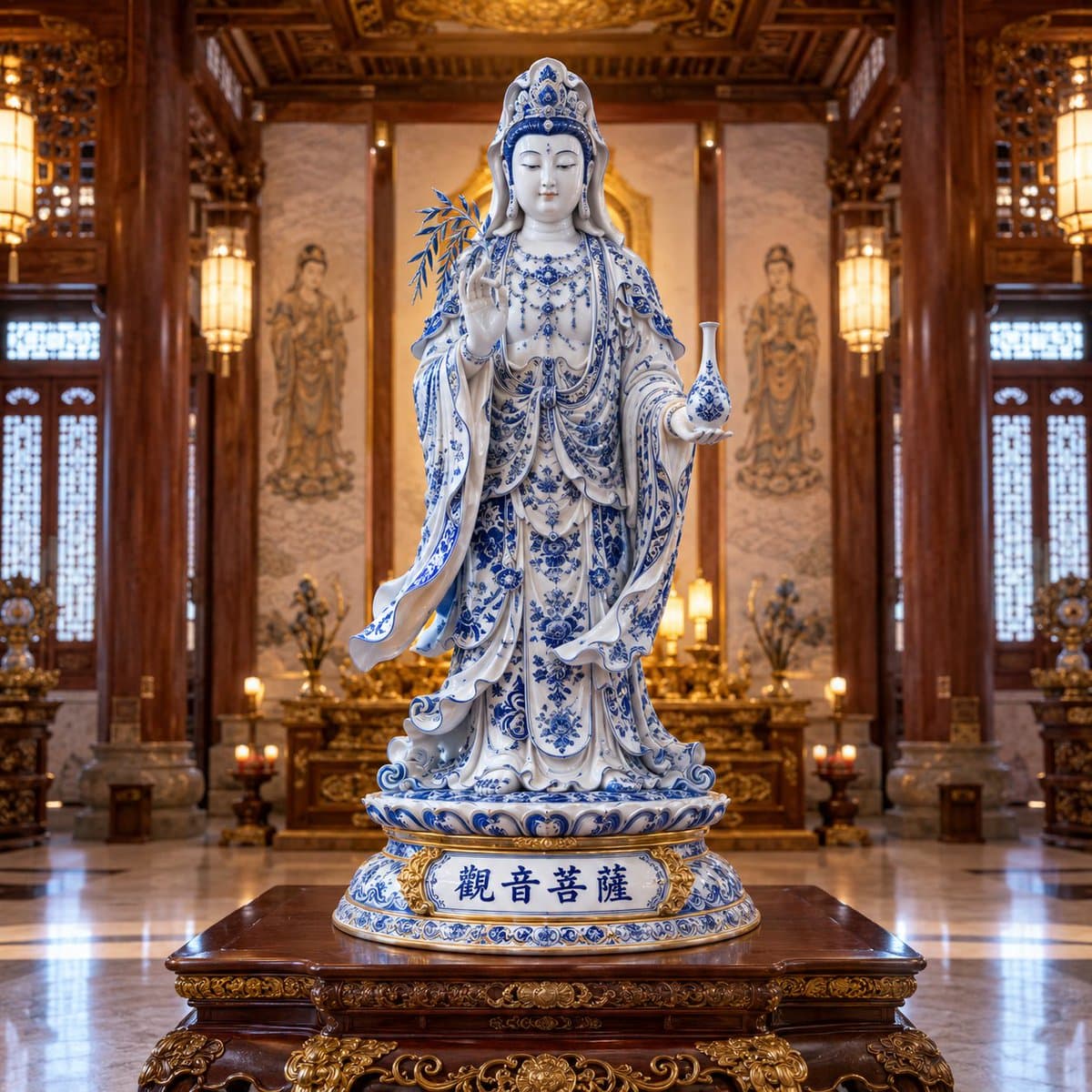
A masterful blue and white porcelain style that elevates visual storytelling. This stunning gallery piece boasts exceptional detail and captivating energy.
View prompt →This is a free AI prompt from Roopify's library. Copy, adapt, and generate your photo in seconds.