Social Media Post
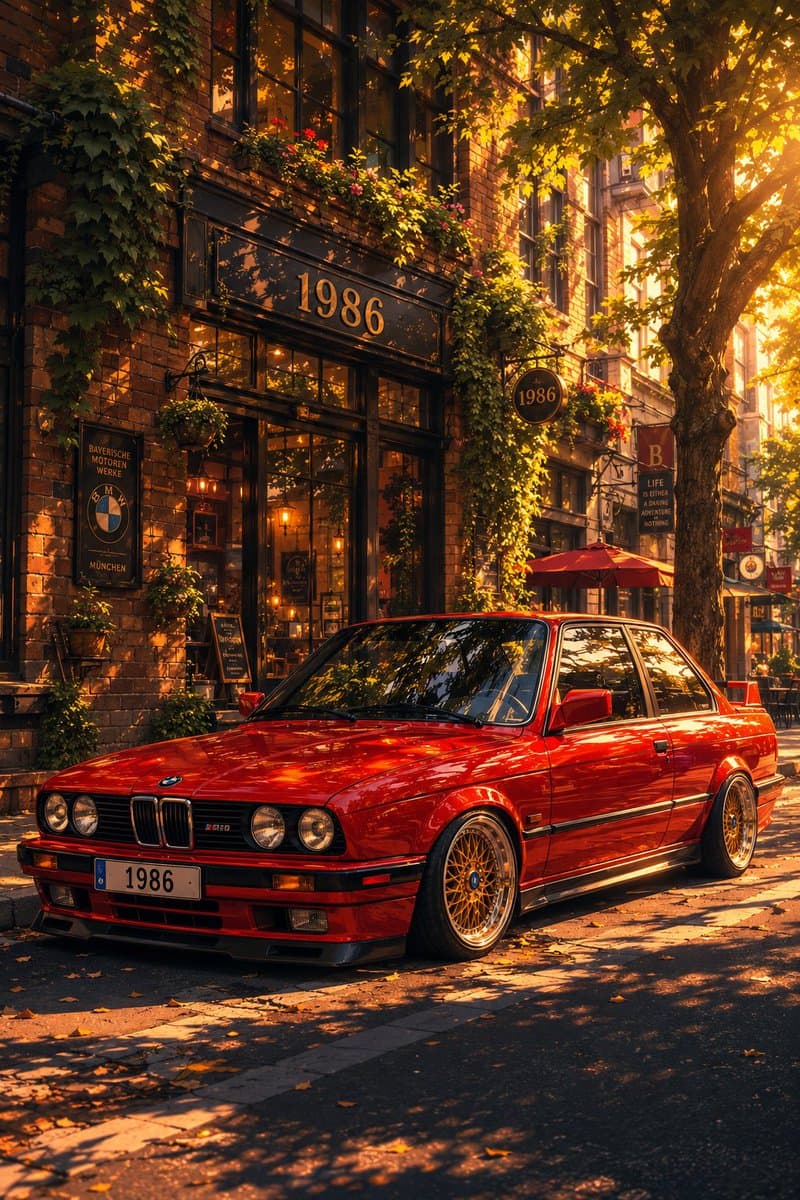
Classic Bmw E30 Urban Illustration Gallery
Step into a world of intricate details with this classic bmw e30 urban illustration gallery. Designed for absolute visual perfection and artistic expression.
View prompt →A masterful detailed japanese newt travel app advertisement that elevates visual storytelling. This stunning gallery piece boasts exceptional detail and captivating energy.
Goal: Create a polished Japanese travel service launch advertisement for {argument name="brand name" default="NEWT"}, combining aspirational airport photography, tropical resort imagery, and app UI mockups in a bright editorial collage. Canvas: Square 4:5 ish social ad, 768×960 feel, portrait oriented composition with generous white space at the top, vivid emerald green brand color, clean modern Japanese typography, premium startup travel campaign aesthetic. Layout: Use a dynamic layered collage. The main subject is a smiling young East Asian woman in the center foreground, waist up to knees, walking with a dark green rolling suitcase handle in her left hand and holding a smartphone in her right hand. She wears a green knit top, loose white pants, and a sheer pale mint striped overshirt, with a woven cream shoulder bag and small green accessory charm. She looks up and to the right with joyful vacation energy. Behind her left side, place a second smiling young East Asian woman in an orange cardigan at an airport terminal holding a drink, with a departure board behind her. Place the headline across the top left and upper center, large and energetic. Put the brand block on the right: a rounded green rectangle with a white turtle like logo, the word NEWT, and a small call to action. Add booking UI cards floating over the right middle area and a hotel card below. Text content: The main Japanese headline should read {argument name="headline text" default="次の旅が、もう始まってる。"}. Add a small upper right Japanese subcopy reading {argument name="subcopy text" default="航空券も、ホテルも、アプリひとつで軽やかに。"}. Add small English copy “TRAVEL FEELS NEW.” near the upper right. Add a small vertical category list on the left with exactly 5 items: AIRPORT, HOTEL, CITY, BEACH, FOOD. The green brand block should show the white logo, “NEWT”, and “NEWTで旅をみる”. Visible collage elements: Include exactly 7 main visual modules: 1 central traveler holding phone and suitcase, 1 secondary airport traveler, 1 airport departure board area, 1 luxury hotel room with ocean view at lower left, 1 food close up with shrimp and vegetables at bottom left, 1 turquoise beach aerial at right, and 1 pastel resort city street at bottom right. Keep them seamlessly overlapped with crisp cutout edges and editorial depth. App UI details: Include exactly 2 floating app cards on the right. Card 1 is a search form with tabs for flights, hotels, and package; destination “ソウル” with “SEOUL, KOREA”; date range “6月20日(金) 6月23日(月)”; traveler/class line “大人1名、エコノミー”; and a bright green button “検索する”. Card 2 is a hotel recommendation card with a resort pool thumbnail, small heart icon, hotel name “NEWT SEOUL 明洞”, rating “4.8” with yellow stars, and carousel dots. Style: High key daylight, glossy commercial travel photography mixed with clean vector UI, saturated emerald green accents, airy white background with subtle blue gradient, natural skin tones, optimistic summer mood, crisp Japanese typography with thick filled green characters for the first phrase and outlined green characters for the second phrase. Add playful dotted flight path and tiny map pin near the top right. Use premium editorial layout, realistic photo collage, sharp focus, no grunge, no watermark, no extra logos beyond the brand.
Goal: Create a polished Japanese travel service launch advertisement for {argument name="brand name" default="NEWT"}, combining aspirational airport photography, tropical resort imagery, and app UI mockups in a bright editorial collage. Canvas: Square 4:5 ish social ad, 768×960 feel, portrait oriented composition with generous white space at the top, vivid emerald green brand color, clean modern Japanese typography, premium startup travel campaign aesthetic. Layout: Use a dynamic layered collage. The main subject is a smiling young East Asian woman in the center foreground, waist up to knees, walking with a dark green rolling suitcase handle in her left hand and holding a smartphone in her right hand. She wears a green knit top, loose white pants, and a sheer pale mint striped overshirt, with a woven cream shoulder bag and small green accessory charm. She looks up and to the right with joyful vacation energy. Behind her left side, place a second smiling young East Asian woman in an orange cardigan at an airport terminal holding a drink, with a departure board behind her. Place the headline across the top left and upper center, large and energetic. Put the brand block on the right: a rounded green rectangle with a white turtle like logo, the word NEWT, and a small call to action. Add booking UI cards floating over the right middle area and a hotel card below. Text content: The main Japanese headline should read {argument name="headline text" default="次の旅が、もう始まってる。"}. Add a small upper right Japanese subcopy reading {argument name="subcopy text" default="航空券も、ホテルも、アプリひとつで軽やかに。"}. Add small English copy “TRAVEL FEELS NEW.” near the upper right. Add a small vertical category list on the left with exactly 5 items: AIRPORT, HOTEL, CITY, BEACH, FOOD. The green brand block should show the white logo, “NEWT”, and “NEWTで旅をみる”. Visible collage elements: Include exactly 7 main visual modules: 1 central traveler holding phone and suitcase, 1 secondary airport traveler, 1 airport departure board area, 1 luxury hotel room with ocean view at lower left, 1 food close up with shrimp and vegetables at bottom left, 1 turquoise beach aerial at right, and 1 pastel resort city street at bottom right. Keep them seamlessly overlapped with crisp cutout edges and editorial depth. App UI details: Include exactly 2 floating app cards on the right. Card 1 is a search form with tabs for flights, hotels, and package; destination “ソウル” with “SEOUL, KOREA”; date range “6月20日(金) 6月23日(月)”; traveler/class line “大人1名、エコノミー”; and a bright green button “検索する”. Card 2 is a hotel recommendation card with a resort pool thumbnail, small heart icon, hotel name “NEWT SEOUL 明洞”, rating “4.8” with yellow stars, and carousel dots. Style: High key daylight, glossy commercial travel photography mixed with clean vector UI, saturated emerald green accents, airy white background with subtle blue gradient, natural skin tones, optimistic summer mood, crisp Japanese typography with thick filled green characters for the first phrase and outlined green characters for the second phrase. Add playful dotted flight path and tiny map pin near the top right. Use premium editorial layout, realistic photo collage, sharp focus, no grunge, no watermark, no extra logos beyond the brand.A masterful detailed japanese newt travel app advertisement that elevates visual storytelling. This stunning gallery piece boasts exceptional detail and captivating energy.
Copy the full prompt
Use the copy button above to grab the complete prompt text.
Open Roopify AI
Click Generate image for free, optionally upload your photo, and generate with this prompt applied.
Customize and create
Swap the subject, style, or details to fit your idea, then generate your photo.
More prompts
Step into a world of intricate details with this classic bmw e30 urban illustration gallery. Designed for absolute visual perfection and artistic expression.
View prompt →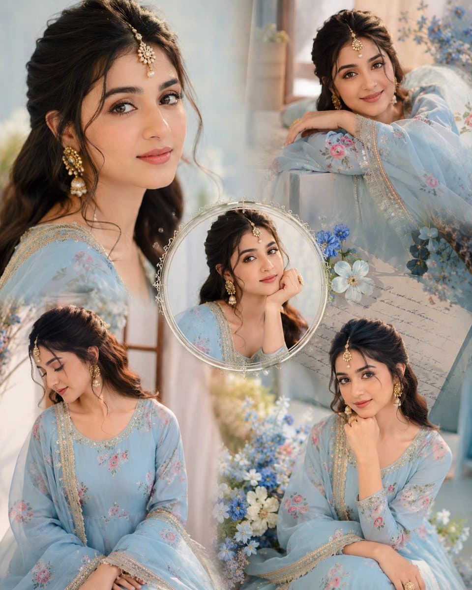
Immerse yourself in this breathtaking indian anarkali fashion collage visuals. Every visual element is crafted with exquisite detail and highly intricate aesthetics.
View prompt →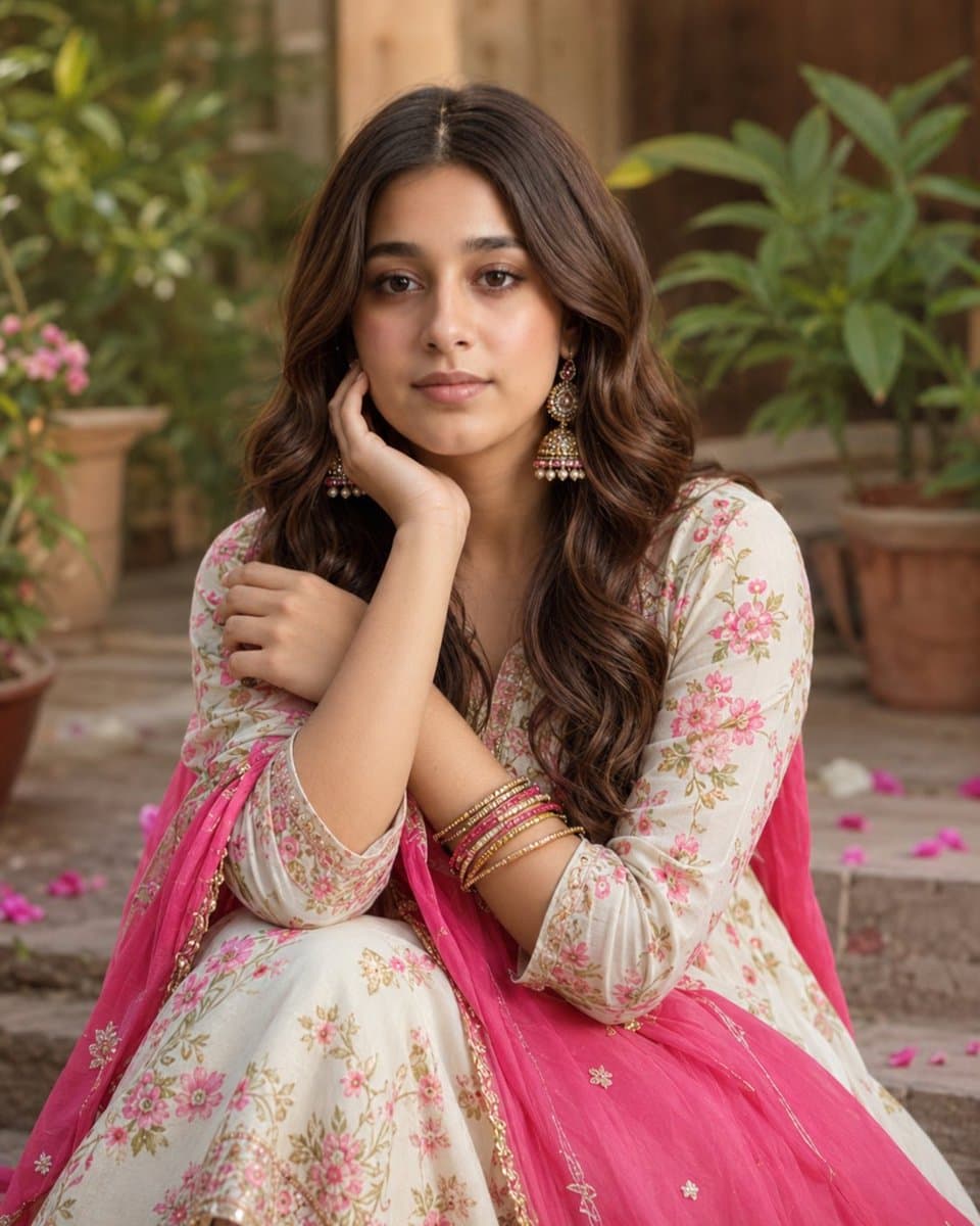
Explore a striking visual composition featuring exceptional facial identity portrait for. Experience unparalleled digital aesthetics and masterful lighting.
View prompt →This is a free AI prompt from Roopify's library. Copy, adapt, and generate your photo in seconds.