Game AssetApp / Web Design
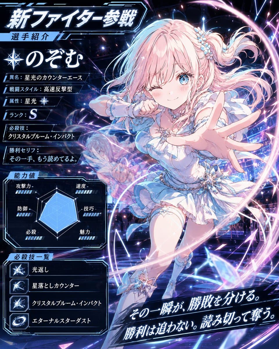
Anime Fighter Introduction Card
Explore a striking visual composition featuring anime fighter introduction card. Experience unparalleled digital aesthetics and masterful lighting.
View prompt →Step into a world of intricate details with this anime character sheet comparison study. Designed for absolute visual perfection and artistic expression.
Goal: Create a wide side by side comparison image of two anime character reference sheets for {argument name="character name" default="夏目るり"}, a student council vice president version, with the faces deliberately obscured by soft rectangular blur blocks. Canvas: Extra wide horizontal canvas, about 1200×429 px, white background, split into two equal panels by a thin vertical gap. Add a small green label centered above the left panel reading “ image2” and a small yellow label centered above the right panel reading “NanobananaPro”. Use thin teal panel borders. Left panel layout: A compact character design sheet with many thin guide lines and small labels. Include exactly 3 large turnaround views across the upper left: front view, side view, and back view. To the upper right, include exactly 1 large eye close up labeled “Eye” and exactly 5 small mouth samples labeled “Mouth”. Along the bottom, include exactly 6 bust expression/action poses in a row: neutral front pose, smiling side pose, sad pose with hand near face, talking on phone pose, eating a sandwich pose with one hand, and relaxed back/side pose with hair down. Keep the left sheet slightly dense and hard to read, with smaller Japanese style annotation text and fine linework. Right panel layout: A cleaner, bolder character setting sheet. At the top left, place a large Japanese headline using this exact text: {argument name="headline text" default="夏目るり 設定画"}. Under it add a small note line in Japanese. Across the upper center, show exactly 3 large head/shoulder turnaround views with horizontal guide lines and repeated “1:1:1” proportion labels: front, side, and back. On the upper right, add exactly 2 feature close ups: one green eye close up with Japanese annotation and one mouth/lip close up with Japanese annotation. Along the bottom of the right panel, include exactly 6 numbered bust expression/action poses with Japanese captions: 1 calm expression, 2 smiling but eyes not smiling, 3 troubled expression, 4 sharp expression checking a phone, 5 eating a sandwich with one hand, and 6 letting hair down. Use thicker outlines than the left panel and clearer spacing. Character details: Anime schoolgirl, teenage Japanese aesthetic, soft brown hair in a high ponytail tied with a blue scrunchie, slightly wavy layered hair with loose side strands; pale skin; large light green eyes where visible in close ups; gray blazer uniform, white shirt, blue ribbon bow tie, dark trim, neat student council look. Expression poses should feel composed, serious, mildly stern, or politely cheerful. Obscure every main face in the bust and turnaround drawings with a centered beige blur rectangle, while leaving hair, uniform, hands, sandwiches, phones, and close up eye/mouth studies visible. Visual style: Clean digital anime reference sheet, soft cel shading, muted colors, thin to medium black outlines, professional character setting art, Japanese design sheet typography, many small annotation lines, comparison chart presentation. Avoid photorealism, avoid 3D rendering, avoid extra characters, avoid logos or watermarks beyond the two top comparison labels.
Goal: Create a wide side by side comparison image of two anime character reference sheets for {argument name="character name" default="夏目るり"}, a student council vice president version, with the faces deliberately obscured by soft rectangular blur blocks. Canvas: Extra wide horizontal canvas, about 1200×429 px, white background, split into two equal panels by a thin vertical gap. Add a small green label centered above the left panel reading “ image2” and a small yellow label centered above the right panel reading “NanobananaPro”. Use thin teal panel borders. Left panel layout: A compact character design sheet with many thin guide lines and small labels. Include exactly 3 large turnaround views across the upper left: front view, side view, and back view. To the upper right, include exactly 1 large eye close up labeled “Eye” and exactly 5 small mouth samples labeled “Mouth”. Along the bottom, include exactly 6 bust expression/action poses in a row: neutral front pose, smiling side pose, sad pose with hand near face, talking on phone pose, eating a sandwich pose with one hand, and relaxed back/side pose with hair down. Keep the left sheet slightly dense and hard to read, with smaller Japanese style annotation text and fine linework. Right panel layout: A cleaner, bolder character setting sheet. At the top left, place a large Japanese headline using this exact text: {argument name="headline text" default="夏目るり 設定画"}. Under it add a small note line in Japanese. Across the upper center, show exactly 3 large head/shoulder turnaround views with horizontal guide lines and repeated “1:1:1” proportion labels: front, side, and back. On the upper right, add exactly 2 feature close ups: one green eye close up with Japanese annotation and one mouth/lip close up with Japanese annotation. Along the bottom of the right panel, include exactly 6 numbered bust expression/action poses with Japanese captions: 1 calm expression, 2 smiling but eyes not smiling, 3 troubled expression, 4 sharp expression checking a phone, 5 eating a sandwich with one hand, and 6 letting hair down. Use thicker outlines than the left panel and clearer spacing. Character details: Anime schoolgirl, teenage Japanese aesthetic, soft brown hair in a high ponytail tied with a blue scrunchie, slightly wavy layered hair with loose side strands; pale skin; large light green eyes where visible in close ups; gray blazer uniform, white shirt, blue ribbon bow tie, dark trim, neat student council look. Expression poses should feel composed, serious, mildly stern, or politely cheerful. Obscure every main face in the bust and turnaround drawings with a centered beige blur rectangle, while leaving hair, uniform, hands, sandwiches, phones, and close up eye/mouth studies visible. Visual style: Clean digital anime reference sheet, soft cel shading, muted colors, thin to medium black outlines, professional character setting art, Japanese design sheet typography, many small annotation lines, comparison chart presentation. Avoid photorealism, avoid 3D rendering, avoid extra characters, avoid logos or watermarks beyond the two top comparison labels.Step into a world of intricate details with this anime character sheet comparison study. Designed for absolute visual perfection and artistic expression.
Copy the full prompt
Use the copy button above to grab the complete prompt text.
Open Roopify AI
Click Generate image for free, optionally upload your photo, and generate with this prompt applied.
Customize and create
Swap the subject, style, or details to fit your idea, then generate your photo.
More prompts
Explore a striking visual composition featuring anime fighter introduction card. Experience unparalleled digital aesthetics and masterful lighting.
View prompt →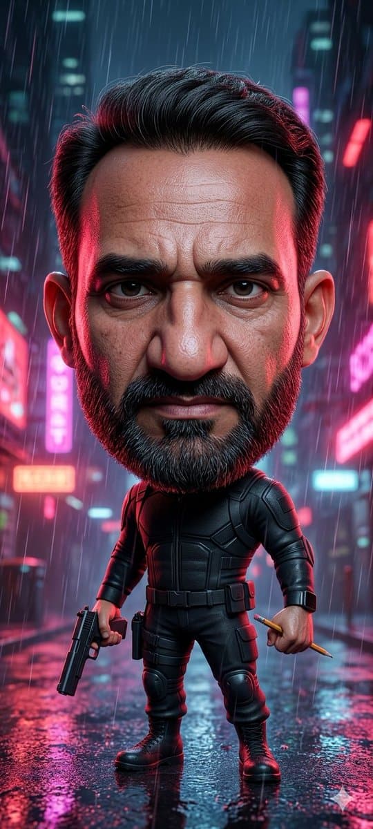
Step into a world of intricate details with this striking cyberpunk chibi tactical hero. Designed for absolute visual perfection and artistic expression.
View prompt →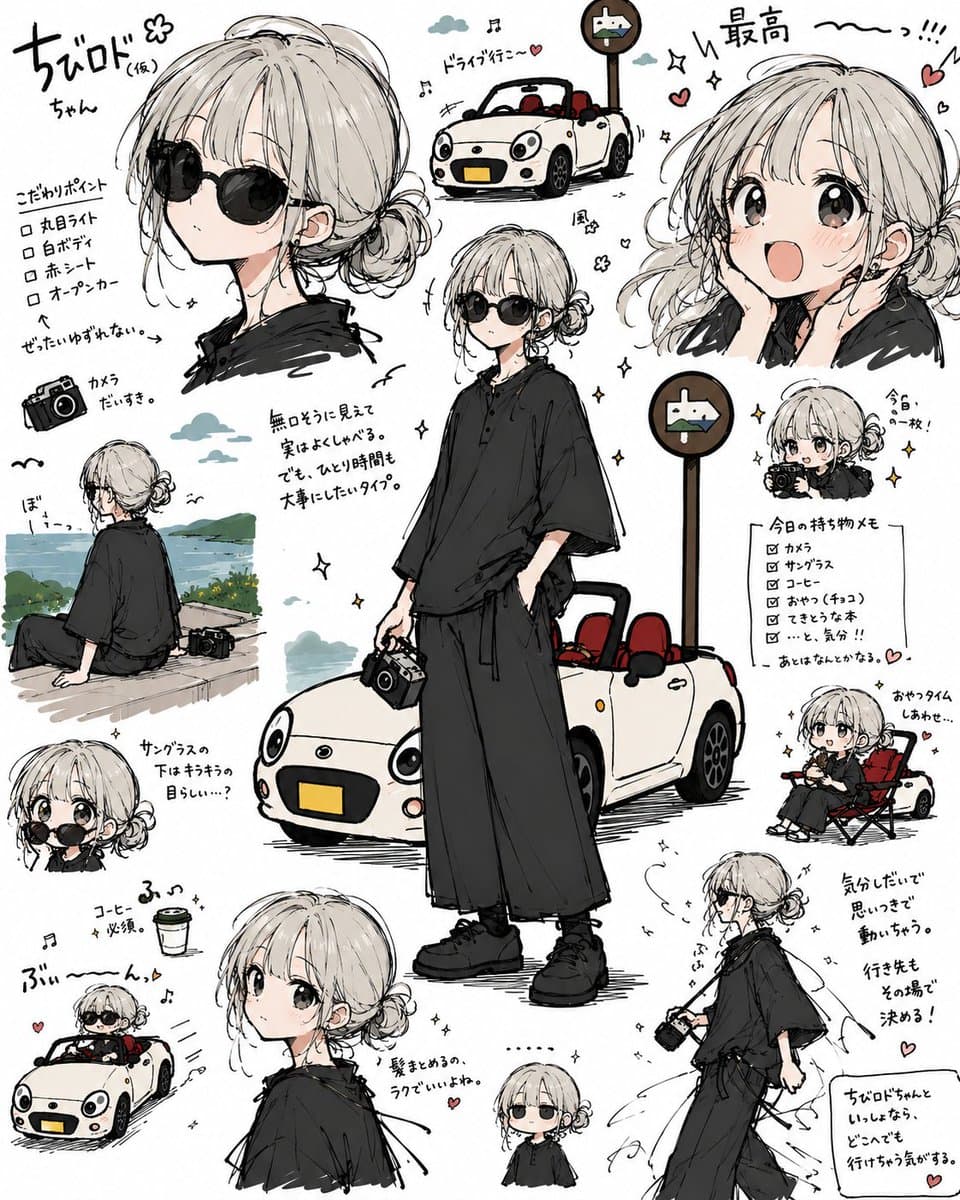
Discover incredible digital aesthetics with this anime travel character sheet collage. A beautifully crafted artwork highlighting meticulous details and vibrant scenery.
View prompt →This is a free AI prompt from Roopify's library. Copy, adapt, and generate your photo in seconds.